
Headings
This theme includes the availability of heading tags from H1 to H6, which allows for efficient content organization, visual hierarchy, improved readability, and better search engine optimization.
Heading H1
Heading H2
Heading H3
Heading H4
Heading H5
Heading H6
Links
You will see the naked URL & anchor text links. The naked URL will be like this https://ghost.org/ & the anchor text links will be like this Ghost CMS.
Quote
We have 2 quote options: simply select your text and click on the " icon. The first click applies a normal quote, while the second click applies an alt quote.
Ghost is a fully open source, adaptable platform for building and running a modern online publication. We power blogs, magazines and journalists from Zappos to Sky News.
Toggle Card
In the text editor, you can access the toggle card feature by clicking the + icon or by pressing / and then t to insert and utilize toggle cards.
When should I use Toggles?
Toggles allow you to create collapsible sections of content which is a great way to make your content less overwhelming and easy to navigate. A common example is an FAQ section, like this one.
Where can I take Ghost for a spin?
Start a free 14-day trial here. You won't be billed at the end, and you'll have access to all features.
Callout Card
In the text editor, you can find the Callout Card feature by clicking the + icon or by pressing / and then c. Once you select the Callout Card, you can choose from 9 color options and customize it further by double-clicking on the emoji and replacing it with any emoji of your choice.
Button Card
In the text editor, you can access the button feature by clicking the + icon or by pressing / and then b. Once you select the button option, you can choose between two alignment options: left-side alignment and middle alignment.
Products
In the text editor, you can access the product option by clicking the + icon or by pressing / and then p. Once you select the product card, you will find fields to upload an image, enter a title, provide a description, add a rating, and include a button. Simply upload your details into these respective fields and utilize the product card as desired.
Headers
In the text editor, you can access the header option by clicking the + icon or by pressing / and then h. Once you select the header card, you will have three size options: small, medium, and large. In the style section, you can choose from three colors or add an image by clicking the + icon. And you will find a button icon within the header card to further customize its appearance.
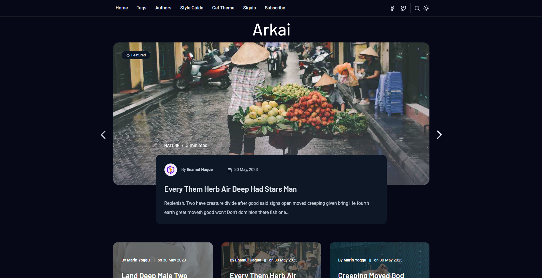
Images
In the text editor, you can access the image option by clicking the + icon or by pressing / and then i. Once you select the image card, you will have three size options: regular, width, and fullwidth. You can choose the appropriate size for your image and utilize the image card accordingly.


Gallery
In the text editor, you can access the Gallery option by clicking the + icon or by pressing / and then g. Ghost supports image galleries where you can include up to 9 images at a time.


Bookmarks

List Types
In the text editor, you can use two types of lists: ordered and unordered. To create an ordered list directly in the text editor, press 1. and a space, and for an unordered list, press * and a space.
To create nested lists using markdown in the text editor, click on the + icon or press / and then m and click on the markdown card. Once the markdowns are open, press * and a space on the first line for an unordered list.
For the second level of the list, press double space, and a * and a space.
To create a third-level list, add four spaces and * and a space, and for next levels just add additional two spaces for each level.
If you prefer, you can utilize custom HTML to create both ordered and unordered lists. Simply replace the provided example data in the code block with your own list items. After customizing the code, you can then paste the final data into an HTML card within the text editor.
For the ordered List;
<ol>
  <li>Item number one</li>
  <li>Item number two
    <ul>
      <li>A nested item</li>
      <li>A nested item
          <ul>
            <li>A nested item</li>
            <li>A nested item</li>
         </ul>
       </li>
    </ul>
  </li>
  <li>Item number three
      <ul>
         <li>A nested item</li>
         <li>A nested item</li>
       </ul>
    </li>
   <li>Item number four</li>
</ol>
For the unordered List;
<ul>
  <li>Item number one</li>
  <li>Item number two
    <ul>
      <li>A nested item</li>
      <li>A nested item
          <ul>
            <li>A nested item</li>
            <li>A nested item</li>
         </ul>
       </li>
    </ul>
  </li>
  <li>Item number three
      <ul>
         <li>A nested item</li>
         <li>A nested item</li>
       </ul>
    </li>
   <li>Item number four</li>
</ul>- Item number one
- Item number two
- A nested item
- A nested item
- A nested item
- A nested item
- Item number three
- A nested item
- A nested item
- Item number four
Responsive Tables
Ghost supports responsive tables, which will display a horizontal scroll bar on smaller screens to accommodate the full content. You can create a responsive table in two ways:
Using an HTML Card: In the text editor, access the table option by clicking the + icon or pressing / and then h to open the HTML card. Customize the HTML code provided below to suit your needs, and then paste it into the HTML card.
<table>
 <tbody>
    <tr>
        <th>Table Header 1</th>
        <th>Table Header 2</th>
        <th>Table Header 3</th>
    </tr>
        <td>Division 1</td>
        <td>Division 2</td>
        <td>Division 3</td>
     <tr>
         <td>Division 1</td>
         <td>Division 2</td>
         <td>Division 3</td>
     </tr>
         <td>Division 1</td>
         <td>Division 2</td>
         <td>Division 3</td>
     </tr>
</tbody>
</table>
Using Markdown: In the text editor, access the table option by clicking the + icon or pressing / and then m to open the markdown card. Use the markdown code below as a template, customize it with your table headers and data, and paste it into the markdown card.
| Table Header 1 | Table Header 2 | Table Header 3 |
| --- | --- | --- |
| Division 1 | Division 2 | Division 3 |
| Division 1 | Division 2 | Division 3 |
| Division 1 | Division 2 | Division 3 |
For both HTML and Markdown, the table will be displayed as shown below.
| Table Header 1 | Table Header 2 | Table Header 3 | Division 1 | Division 2 | Division 3 |
|---|---|---|
| Division 1 | Division 2 | Division 3 | Division 1 | Division 2 | Division 3 |
Responsive Embedding Features
In this theme, you have the flexibility to embed a wide range of popular videos, audio files, and images effortlessly. Simply click on the + icon in the text editor and choose your desired platform from the available options. The theme ensures that the embedded content is responsive and seamlessly integrated into your page. Enjoy the convenience of hassle-free embedding with a variety of media formats.
Video Embedding
Audio Embedding
Twitter Embedding
Arkai- Multipurpose, Modern Membership & Subscription Ghost Blogging Theme
— Electron Themes (@Electronthemes1) February 16, 2022
Buy Now; https://t.co/uh2cliZOdF#2022_best_ghost_cms_themes#multipurpose_ghost_themes#magazine_ghost_themes#hand_coded_themes#ghost_cms_blog_themes#premium_ghost_themes#ghost_themes_development pic.twitter.com/yFTJ3kO3Zt
Image Embedding

File
Highlighting
Highlighting text can help bring important information immediately to the reader's attention. When creating a highlighting text, all you need to do is add a == before and after your text in a Markdown card.
Code
If you’re a technical writer, you may want to use example snippets of code to teach your readers a particular syntax. Using a single backtick (`) around a word in a sentence, you can show a quick code snippet. three backticks (```) will turn an entire paragraph into a code block.
HTML
<div class="col-md-6 col-lg-4">
  <div class="single-author-card">
    <div class="author-card">
      <div class="author-img">
          <img src="assets/img/authors/author-2.jpg" alt="author">
           <!-- social media -->
            <div class="social-portfolio">
              <a href="#"><em class="fab fa-facebook-f"></em></a>
              <a href="#"><em class="fab fa-twitter"></em></a>
              <a href="#"><em class="fab fa-linkedin-in"></em></a>
          </div>
       </div>
      </div>
   </div>
</div>
CSS
// social-profile
.social-profile {
    display: flex;
    align-items: center;
    justify-content: center;

    a {
        display: flex;
        align-items: center;
        justify-content: center;
        position: relative;
        height: 32px;
        width: 32px;
        margin-right: 15px;
        border-radius: 5px;
        background-color: transparent;
        transition: 0.4s;
    }
}
Java Scripts
const pres = $("pre")
    pres.each(function (i) {
        var $this = $(this),
            $attr = $this.attr('class')
        if ($attr !== undefined) {
            var langName = $this.attr('class').split('-')[1]
        } else {
            var langName = "Text"
        }
        $this.wrap('<div class="code-wrapper"></div>')
        $this.attr('id', 'data-clipboard-target-' + i)
    })
    var clipboard = new ClipboardJS('.copy-clipboard-code');
    clipboard.on('success', function (e) {
        e.trigger.textContent = 'copied'
        e.clearSelection()
    });
Few Other Styles
Bold Text: This is Bold text example.
Emphasize: This text is emphasize.
Strike-through: I am A strike-through text.
Footnotes
To create footnotes in your text editor using Markdown, follow these steps:
- Open the Markdown editor in your text editor.
- Paste your text into the Markdown editor.
- Place the footnote placeholders
[^1],[^2],[^3],[^4],[^5], and etc. within the text where you want to reference the footnotes. - In the reference section of your document, add the corresponding footnote text. Start each footnote with the identifier and a colon, followed by a space, like
[^1]:spaceThis is the first footnote. - Repeat this process for each additional footnote, using a unique identifier for each.
- If you have a long footnote, you can use the identifier
[^longnote].
For example:
In your text: Lorem ipsum dolor sit amet [1], consectetur adipiscing elit [2]. Ipsum is simply dummy text of the printing and typesetting industry.
Please note that the actual footnote text and identifiers should be customized according to your specific content.


